Site Survey • Engineering • Fabrication • Permitting • Installation
Monument signs are ground-level identity signs designed for maximum curb appeal, long-term durability, and clear wayfinding.
This guide covers foundation engineering, materials (stone, aluminum, foam core), illumination options, permitting and size regulations,
and how to integrate landscaping so your sign looks intentional—not like an afterthought.
Whether you manage a multi-tenant property, a corporate campus, a healthcare facility, or a retail site, a well-built monument sign
becomes part of the property architecture. The best results come from planning the base, structure, and electrical early—so permitting,
installation, and finish details stay predictable.
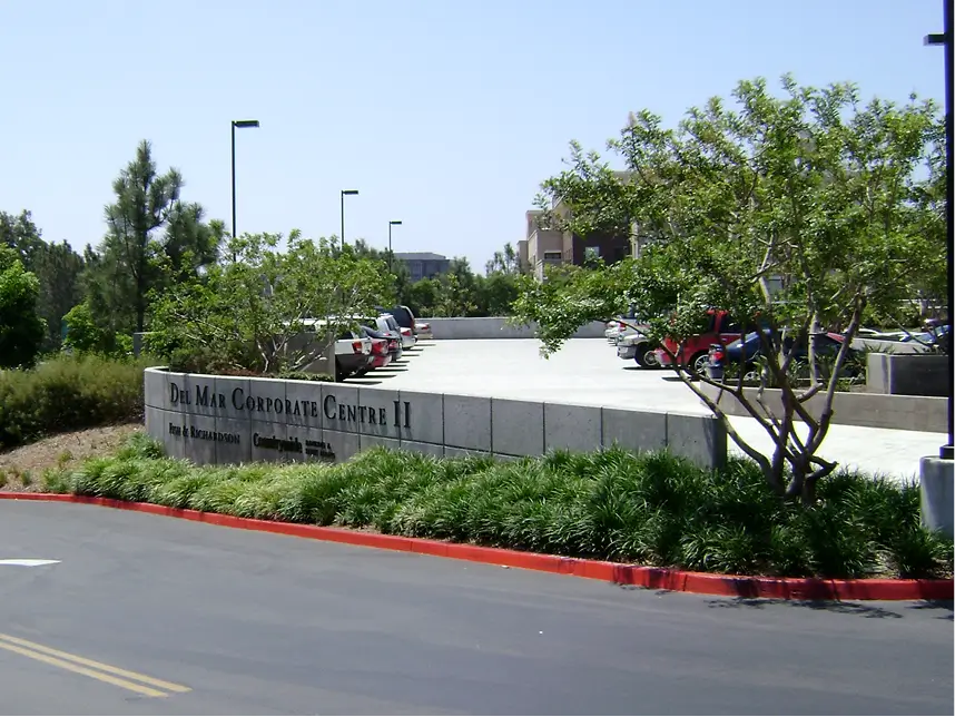
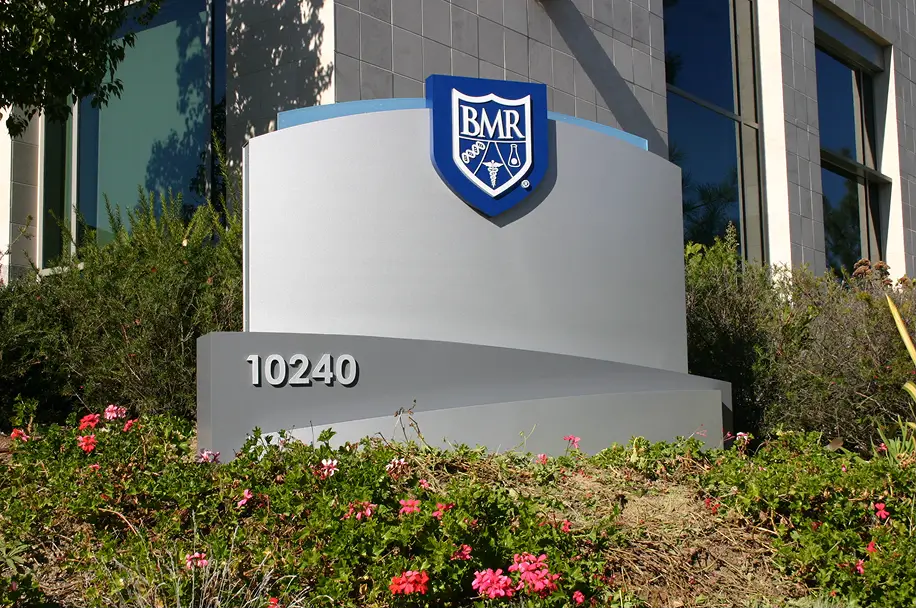
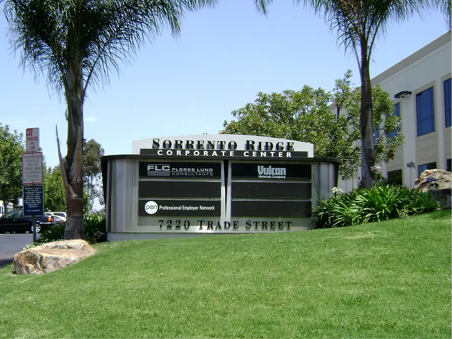
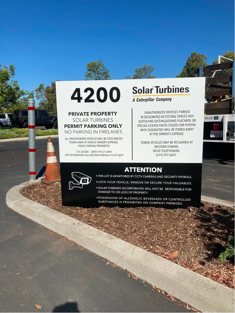
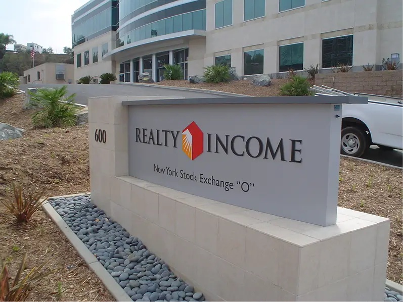
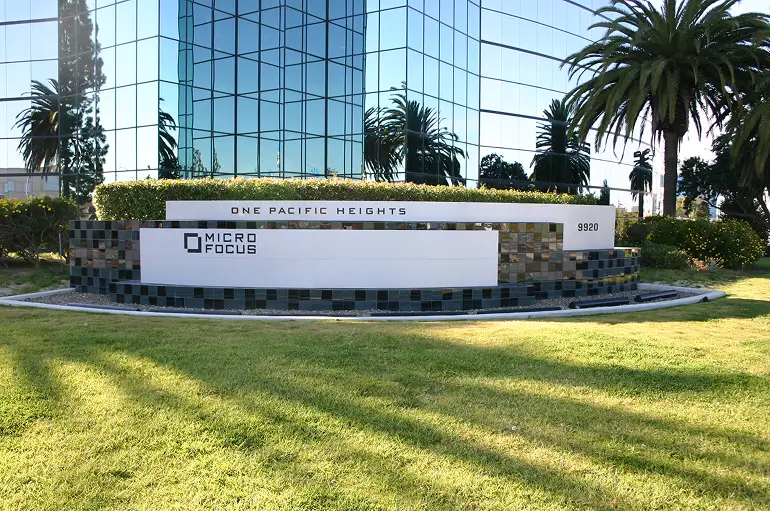
A monument sign is a freestanding, ground-mounted sign structure typically placed near entrances, drive lanes, or primary street frontage.
Unlike pole signs, monuments sit low to the ground and rely on architectural mass, premium finishes, and thoughtful landscaping to create a high-end presence.
Monument signs are often used for identity (the main property name), tenant panels (multi-tenant sites), directional messaging, and brand reinforcement.
They also play a major role in wayfinding—helping visitors quickly locate the correct entrance without confusion.
The most successful monument signs are planned as a system: structure + base + copy layout + illumination + landscaping.
When those elements are engineered together, the result looks like it belongs to the property architecture and holds up for years with minimal maintenance.
Foundation engineering is the part most buyers don’t see—but it determines whether a monument sign stays level, resists wind loads,
and avoids cracking or settlement over time. A professional approach starts with a site survey, soil considerations, and a clear structural plan.
Many jurisdictions require engineering documentation for larger monuments. Even when not required, engineered detailing is a best practice
because it reduces risk—especially on high-value properties where a failed sign becomes a visible liability.
A quick planning tip: if you want the sign to feel “anchored” and premium, the base mass should be proportional to the sign cabinet/face area.
That proportion is aesthetic, but it’s also structural—heavier finishes require the right footing strategy.
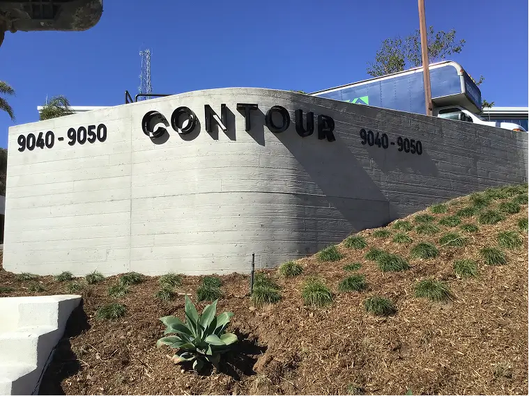
Monument signs can be fabricated in several ways depending on budget, design intent, and durability requirements.
The materials you choose affect lifespan, maintenance, and how “architectural” the sign feels.
| Material / System | Where It Shines | Considerations |
|---|---|---|
| Stone / Masonry Veneer | Premium look, ties to building architecture, high curb appeal | Heavier build; needs proper waterproofing, drainage, and skilled install |
| Aluminum Cabinets / Architectural Metal | Durable, clean lines, modern aesthetic, good for illumination systems | Finish quality matters (powder coat vs paint); needs good sealing |
| Foam Core (HD Foam) with Coatings | Cost-effective 3D shapes, custom textures, lighter weight | Requires correct coatings; impact resistance varies; best for controlled environments |
| Hybrid Builds (Stone Base + Aluminum Face) | High-end appearance with strong illumination and service access | More coordination; must plan transitions to avoid water intrusion |
Stone and masonry finishes give monuments a premium, permanent feel. The details matter: waterproofing behind veneer, drainage strategy,
and clean cap design help prevent moisture issues. The foundation and structural frame must be sized for the additional weight.
Aluminum is a strong choice for modern monument designs. It offers excellent corrosion resistance, clean edges, and reliable performance for illuminated faces.
Quality depends on gauge, internal framing, sealing, and finish selection for UV resistance.
Foam core monuments can deliver strong dimensionality at a lower cost, especially for unique shapes or branded forms. The critical factor is the protective coating system:
coatings must resist UV exposure, moisture, and impact. Foam is best used when it is engineered for the environment and protected from constant abuse.
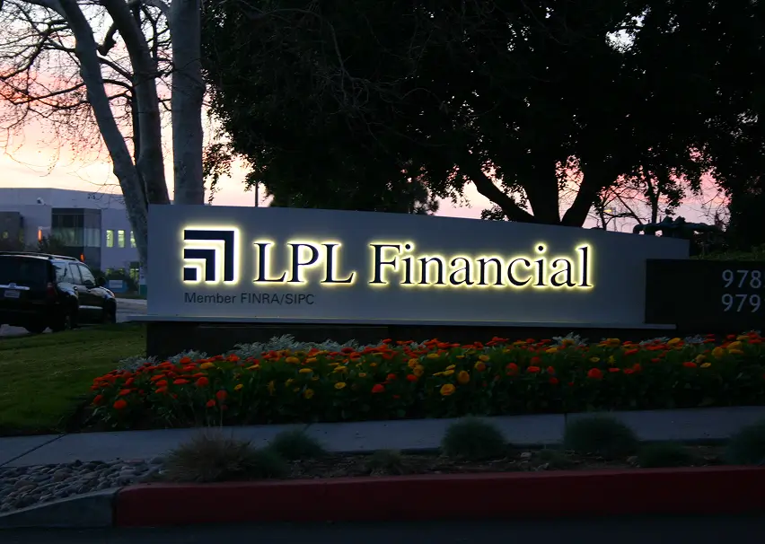
Monument sign illumination should improve readability and elevate curb appeal without creating glare or code issues.
The “best” lighting depends on your sign face design, local rules, and surrounding ambient light.
Internal illumination is often the most readable at distance, especially for road-facing frontage. External illumination can look more architectural and refined,
particularly when paired with stone textures and landscaping. In many cases, a hybrid approach works best: internal illumination for copy + external accents for architectural presence.
Lighting should be engineered for uniformity and reduced glare. That means appropriate diffusion, correct LED spacing, and thoughtful positioning of fixtures if external lighting is used.
For properties with strict ordinances, brightness controls and shielding may be required.
Monument signs are heavily regulated because they affect streetscape visibility, traffic sightlines, and neighborhood aesthetics.
Most jurisdictions limit height, sign area, setback distance from the road, and illumination type/brightness.
In commercial corridors, regulations may be more flexible. In mixed-use or residential-adjacent zones, rules are often stricter.
Beyond city ordinances, landlords, HOAs, and master associations may enforce their own design standards.
The fastest way to keep permitting smooth is to confirm constraints early and design within them. If the sign is undersized for visibility,
the better solution is often improved copy hierarchy, contrast, and illumination—not simply trying to push height beyond what is allowed.
Landscaping is the difference between a monument sign that looks like it was “placed” and one that looks like it was “designed” for the property.
Done correctly, landscaping frames the sign, improves visibility, and supports wayfinding—without blocking copy or creating maintenance headaches.
Lighting and landscaping should be planned together. If you use external lighting, plant height and placement should not cast shadows across the face.
If the sign is internally illuminated, landscaping can be used more for framing and aesthetics than for lighting performance.
A simple best practice is to keep plantings below the lowest copy line and avoid fast-growing shrubs directly in front of tenant panels.
This protects readability and reduces “hidden sign” problems that can create complaints from tenants or visitors.
Your sign is your first impression. Let’s make sure it gets approved, built, and installed without surprises.