- July 9, 2019
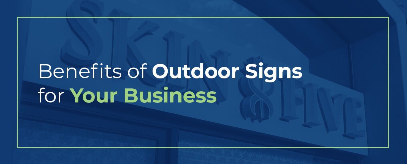
How to Design a Business Sign
Do you ever notice how some custom made signs stand out and hold your attention while others seem to disappear in their surroundings? If you can tell the difference, so can your audience.
Businesses with eye-catching, informative and easy to read designs are bound to attract more customers than those with poorly planned signage. Every detail you choose says something about your company, down to the colors and font styles. For this reason, you need to plan carefully.
Designing a business sign may seem like a daunting task — there are many options and variables to consider. Our guide will help you through the process so you can narrow your focus and create the best possible sign for your needs.
What Should Your Sign Do for You?
Before you begin planning specific details, you need to decide on the general aim of your sign. Knowing what you are looking to accomplish and how you want to represent your business is essential to creating an effective design.
By answering a few simple questions, you can start thinking about the best way to organize your first draft. These questions include:
1. What Is Your Target Audience?
If you want your sign to be as effective as possible, you need to consider your audience. Who are you looking to attract with this particular sign? What demographics match your business? How can you appeal best to them? The answers to these questions will quickly point you in the right direction.
You also need to decide whether you are targeting clients, potential customers, investors, patients, shoppers or nearby motorists. Each demographic will respond best to different types of signs. This may change the nature of the design entirely — especially in the case of drivers.
People who are driving past need to be able to read your sign in about three seconds. That’s all the time you have to make an impression. In this case, your message needs to be clear, readable and brief. If your sign is cluttered or poorly planned, you’ll likely see fewer customers.
2. What Is the Sign’s Primary Purpose?
While this may be obvious to you, it’s an important detail any designer needs to know before planning anything. Depending on your business, your sign should have a particular purpose.
Some potential objectives include advertising to attract new customers, impressing viewers with a professional or elegant look, rebranding your business or even just creating a perception of your company. Every detail can affect what your sign presents and accomplishes, so having a solidified purpose in mind before beginning is a must.
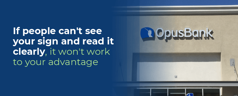
3. How Visible Is Your Sign From Its Location?
Visibility is a significant factor. If people can’t see your sign and read it clearly, it won’t work to your advantage. Consider where your building sits, what direction it faces and your nearby competition.
If your business is tucked back, away from the roadside, you’ll need a sign that stands alone. Buildings closer to the street may have less space, so they’ll do better by using the storefront space. On busy highways, you’ll need to cater to motorists, which means fewer words and larger lettering.
Take a look at the signs of businesses surrounding yours. If you’re in an industrial area and each company has a sign with a lot of height, your best shot at competing may be choosing a pylon style. There’s also a tone to consider — for example, corporate complexes may seem more professional with a monument sign.
With these details, you can better determine what style sign will best suit your needs and continue the designing process with confidence.
How to Pick the Right Type of Sign
Depending on the intentions and location of your business, individual styles of outdoor business signs will suit your needs better than others. Since there are more than a few models to choose from, it’s useful to weigh all your options before committing or beginning a design.
The available styles include:
- Blade: The blade style, also known as a projecting sign, is one of the most attractive types you can choose. Blade signs jut out from the sides of buildings or storefronts and are available in many different shapes and sizes. They mount to an external wall with either a standard pole or frame system or decorative armature. Blade styles include both illuminated and non-illuminated options, as well as hanging business signs.
- High rise: If your company is the primary tenant of a high rise, and you have the rights to brand the building, you’ll need a large, clearly visible sign. High rise signage is precisely for this purpose, using illuminated channel letters to showcase the company name. They either attach to the building with a frame connected to the roof or through glass windows.
- Monument: Signs that aren’t attached to the building but are independent structures near the street are called monument signs. These provide you with a substantial amount of design space and can convey straightforward details, like the address, as well as the mood of the building. Monument signs allow you to play with architectural structure, so you can match it to your building’s design and enhance your property.
- Neon: For a retro feel and a bright pop of color, consider investing in a neon sign. It’s easily noticeable and will stand out in the evening, but it is more of a commitment than your other options. If you’re willing to put in the time and money, neon will undoubtedly give your business a unique look.
- Push-thru: Sign crafters create push-thru signs by routing out letters or designs in cabinet faces or aluminum. Then, they push acrylic through the face to give your company name dimension. You can choose to have the sign illuminated from the faces and sides of the letters or the sides alone. Push-thru signs can be elegant and highly readable when you design them correctly.
- Pylon or pole: The pylon sign has a specific feature that makes it valuable — height. They stand well above your other options and are prevalent in plazas and strip mall areas with high traffic. If you want to use height to your advantage, advertise multiple businesses in a center or compete in an industrial area, pylon signs are an excellent choice.
- Vinyl graphics: With vinyl graphics, you can turn any glass surface into a business sign. If your building has glass doors or large front windows, you can use graphics to display your company name, logo, business hours, address and any other information. While you may still want to include a more substantial, illuminated sign elsewhere, vinyl provides a second opportunity.
- Exterior non-illuminated: You can still have an effective sign without lighting. Non-illuminated signs are made from aluminum or acrylic channel letters without LEDs and come in a broad variety of depths, colors and sizes.
- Exterior face lit channel letters: One of the most common styles of illuminated signs, face lit channel letters are made of aluminum returns, acrylic faces and internal lighting. They can be elegant or bold, and you can customize the depth for readability.
- Exterior reverse channel letters: Also referred to as halo lit, reverse channel signs are the opposite of face lit channel letters. They provide a softer glow and a completely different ambiance. Each letter is composed of a fabricated face, aluminum returns and a transparent backing to evenly diffuse interior lighting, which shines on the wall behind the characters.
When you’re deciding on a sign, you should review your answers to the earlier questions. Each of these sign types fits ideally into specific spaces. You may be able to choose from several, or there may be a specific style that works best for your business.
How to Design Your Sign
Once you choose the perfect sign style, you’ll start creating a working design draft. Your draft includes everything from words and graphics to the layout as a whole. All of the elements should work together to form an attractive, readable and cohesive arrangement.
To make the most effective design possible, you should carefully consider the words you want to include, tactics to make your sign visually appealing, color combinations and text size. Each of these pieces is crucial to creating the best sign for your company’s needs.
What Should Your Sign Say?
In the first stages of planning, you should have determined the purpose of your signage. This will come in handy for deciding what words to put in your design.
Every word you use should suit the primary purpose of your sign, and each letter is a design element. Whatever you choose to put on your sign, you need to find a balance between informative and visually appealing. Carefully choosing what you include will help keep your message and layout clear.
When you’re thinking of outdoor business sign ideas, less really is more. Typically, the rule of thumb is to use seven words or less. Overcrowding signs with words is a common problem that can cause your audience to be confused or put off. Including less also allows motorists ample time to read your signs — remember, they only have about three seconds.
While you should keep it brief, using a single word isn’t the best idea for a retail sign, either. With just a name, your audience can’t tell what kind of business you’re running. Adding a descriptive word or phrase like “salon,” “bistro” or “law offices” will attract the attention of consumers looking for your products or services.
Ultimately, you want to keep your message clear. Use as few words as you can to get the necessary details across. The fewer words you use, the more room you’ll have for other design elements and branding.
How Can You Make Your Sign Visually Interesting?
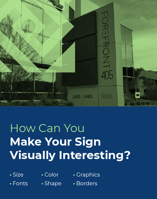
The point of any retail signage is to inform potential customers of your business and brand. But, for people to read it, your sign first has to attract their attention.
Each element you include can be styled to make your design visually interesting. You should aim to create a balanced and cohesive design by using a combination of contrasting elements, including:
- Size: If you have multiple words or phrases you want to use, and all the text on your sign is the same size, it’s going to look relatively boring. Try using contrasting sizes instead. You can highlight the most important word or phrase by making it larger than the others. However, there should still be a balance to it — stick to two or three different font sizes, depending on how much information you include.
- Fonts: Just as with size, using all the same font can make your sign look dull. But selecting two or three different fonts can help make the essential information stand out. You can mix serif and sans serif fonts for variety, or use whatever typography you wish. Keep in mind that every font projects a mood and not all of them mesh well together. Most classy and professional fonts will match well with one another, whereas they typically do not pair with casual or fun font styles. You can also use bolds and italics for emphasis.
- Color: Contrasting colors are also helpful for making specific words pop. Choose colors that your audience can easily differentiate from a distance, rather than using similar hues like blue and black. You can also vary the values of these colors. Give your most important words the darkest value and use other shades for supplemental or less crucial information.
- Shape: Choosing the general shape of your sign is another way to create a visually appealing design. The most commonly used forms are horizontal and vertical rectangles and perfect squares. But you can also choose from a broad variety of other shapes, including circles, ovals, cut out letters and any other custom designs. Using a shape that fits with your company’s name or brand will look more attractive than using a plain rectangle, and it will easily stand out from other signage.
- Graphics: You don’t have to use graphics in your business sign design, but there’s no doubt that they catch attention. Signs with full-color graphics from photos generate a much higher recall rate than those that don’t use an image. If you do choose to include a photo, be sure to space it well with your words and keep a balance.
- Borders: Believe it or not, adding a border can increase how fast passing consumers read your sign. Bold borders create a solid outline for where your readers’ eyes should stay and guide their focus to the central point of the sign. This can be helpful for any business looking to post their signage on a busy road or highway.
Using contrast in each of these elements will help you create a dynamic and attractive sign. While every detail is significant, including variety will show the crucial points and make your design pop.
What Are the Best Color Combinations to Use?
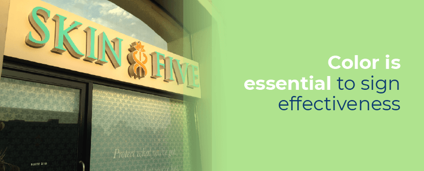
Color is essential to sign effectiveness. You want the essential parts of your design to stand out. Whether it is a word, phrase or logo, using contrast will make it instantly noticeable. Contrasting colors help differentiate words from the background or, for channel letters, one word from the others.
Several color combos are particularly noticeable. Placing lighter colored words on a darker background makes the letters appear larger and easier to read. For example, light gray words stand out better on a red sign than red words do on a gray background.
However, white is one of the most versatile background colors, as you’ll have far more options for lettering hues. Naturally, nearly every other color contrasts well against white. When you choose a colored background, make your decision carefully, as you’ll be limiting your options.
If you’re looking for more contrast, try dark lettering against a light background, like black on white or yellow. If you want high visibility, put light letters on a darker background, like yellow letters against navy blue.
How Big Should Your Sign Be?
Sizing your sign is one of the last steps you should consider. Many people make a guess or try to find a mathematically viable size and confuse themselves. But there is a way to go about finding the best size.
The trick is to size your letters before the sign — sort of like reverse engineering. Your audience needs to be able to read the words you have carefully chosen, so the lettering size is far more critical. If you decide on sign dimensions beforehand, you’ll likely end up forcing fitting letters with odd sizing. Focus on this first, then fit the sign around the words.
The two factors you should use to determine the size of your lettering are distance and the speed of passing vehicles. You need to know from how far away your sign needs to be readable, at a standstill and while in motion. Letter sizing calculators and design consultants can help you calculate exactly how large your lettering should be.
Shop Sign Ideas With Integrated Sign Associates

Integrated Sign Associates will show you how to design a business sign that’s perfect for your company. Our well-seasoned team will take you from the first consultation phase all the way through installing your custom sign, keeping you involved through the whole process.
We are a full-service company with all of the latest tech and machinery, so you can rest assured that your finished product will be top quality. Throughout manufacturing, we use the best materials available to create a sign that is vibrant and long-lasting. It’s no wonder our customers include the businesses of Rodeo Drive.
Get started creating your dream sign — contact us by phone or fill out our online form.