- October 16, 2020
How to Create Engaging Signs
Simply adding a sign to your location can encourage more brand awareness and sales in your surrounding area. If you rely on foot traffic, it lets your customers know where you are and who you are. It’s the reason why nearly every business has some kind of signage. With every company employing signage, yours must be engaging, memorable and different.
As your dedicated sign experts, we know how to create engaging signage. We’ll share our expertise with you so you can promote your business with an effective, well-designed sign.
Table of Contents
- Tips to Create an Engaging Business Sign
- Increase Your Sign’s Engagement With Integrated Sign Associates
Tips to Create an Engaging Business Sign
For your sign to make an impact, it needs to be readable, noticeable and attractive. Following a few design principles and tricks of the trade can produce signage that does all three. Here are our top tips for creating engaging outdoor signs, and a few tricks for indoor signs, too:
1. Keep It Short
If you’re like most businesses, you’ll place your sign in a high-traffic area. A busy roadside may have cars traveling 30 mph to 50 mph. The industry rule of thumb for billboard design says drivers will only have about five to 10 seconds to read a highway advertisement. Billboard designers usually recommend seven words or fewer. You can apply a similar principle to roadside signage for off-highway travel.
According to the International Sign Association, a road with two lanes in each direction where traffic moves 25 mph to 30 mph will need to be readable at 410 feet away. The same speed with single-lane traffic will need to be readable from 155 feet out. At over 65 mph, two lanes of traffic will need visibility at 720 feet, and one lane will need visibility at 280 feet. No matter the distance, large text and a short message are critical.
Even with signs meant for pedestrians, brevity is best. While customers traveling on foot may stop to read a longer message, you can’t count on it. Shoppers are often distracted. Maybe they’re wrangling kids or experiencing tunnel vision on their hunt for something they need. Breaking through to these passersby can attract more foot traffic to your location and make new customers aware of your brand.
The fewer words you can use without sacrificing your message, the better. Make bold statements. Cut unnecessary words. Stick to one message. Sometimes, your logo is all you need. Let your graphics speak for themselves.
2. Think About Contrast
Contrast is crucial to vision and readability. It’s the reason why it’s so hard to see someone wearing all black at night. Contrast is attractive for any customer. It’s even more essential for viewers over 40, the age where vision usually starts to decline. As people age, their retinas become less sensitive, making colors appear faded and less noticeable.
High-contrast color schemes make your message more readable. Color variation between your sign and the surrounding environment can also help your message stand out. This design element can be particularly crucial in a busy commercial area, where your signage competes with many other stores and businesses.
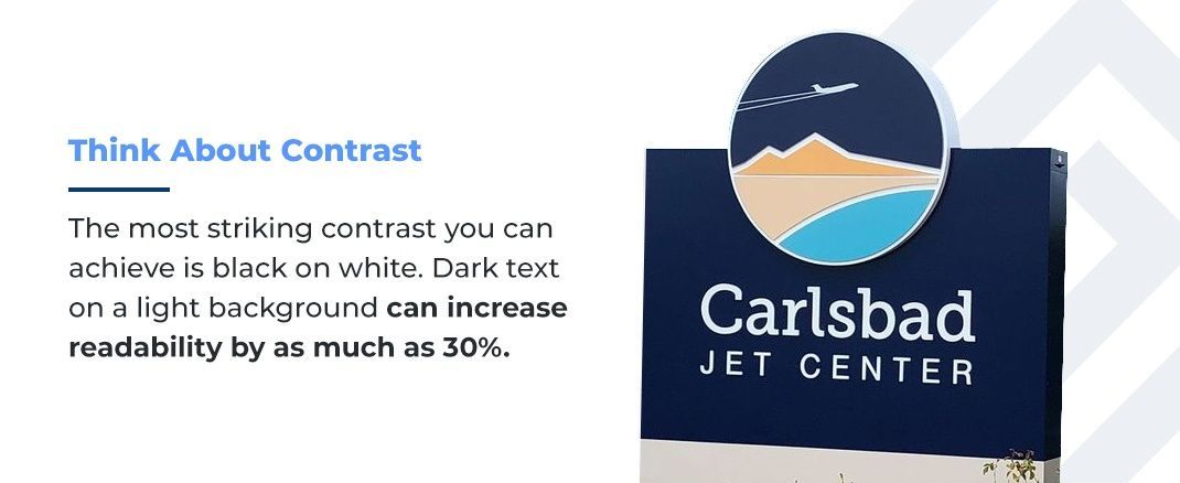
The most striking contrast you can achieve is black on white. Dark text on a light background can increase readability by as much as 30%. Other research shows light backgrounds are more difficult to see during the day because of the low contrast. So, striking the right balance for your location is vital. One solution could be to use a dark background for daytime contrast and illuminate it at night to increase perceptibility. Bold color choices, such as a bright orange or green, can help your sign stand out. Just remember to choose colors that fit your brand’s color palette.
3. Consider Sign Size
A scale large enough to see at a distance is essential for any sign. A sign that’s too small won’t do its job of bringing in new customers. While you should aim for as large as possible, the size you choose often depends on the application. For example, high-rise signage mounted to buildings parallel to the road will need to be 70% larger than a sign mounted perpendicular to the road. Pylon signs are the tallest type of outdoor signage, meant to be visible along busy roads and highways.
A storefront blade sign needs to account for heavy sidewalk traffic. These signs hang off a building’s facade or beneath a storefront awning, catching the attention of nearby foot traffic. They can’t be so big that they impede movement or make it hard for taller pedestrians to pass.
With interior signage, it’s crucial to select a size that works with your space’s interior design. For example, the most visually pleasing size logo for a lobby sign is about half the length of the installation wall. If the wall is 12 feet wide, the logo will likely be about 6 feet. If you’re looking for a larger-than-life sign for interior use, consider vinyl graphics. These can wrap around glass windows or even entire rooms.
4. Think About the Font Choice
Even if you have 20/20 vision, there’s a point where text becomes too small to read. Now, imagine trying to read text from 50 feet away while in a moving vehicle. For outdoor signage meant to be visible from the road, the text needs to be easy to read. The font needs to be bigger and simpler than you might think. Experts recommend letter heights of 1 inch per 25 feet of visibility distance.
Not all drivers have perfect vision — 75% of Americans use corrective eyewear, like glasses or contact lenses. And as many as 15% to 20% of people have some symptoms of dyslexia, such as slow or inaccurate reading or mixing up words. Either poor vision or reading difficulties could affect drivers’ ability to read a complicated font. Even pedestrians who have excellent eyesight will likely prefer font choices that are more readable at a distance. They’re more likely to read and understand your message. They’re also more likely to enjoy looking at it.
How can you choose the most readable font for your signage? One study of readers diagnosed with dyslexia found the typeface Arial reads faster than fonts like Times New Roman and Garamond. The same research showed these readers have a strong preference for Verdana and Helvetica. These highly readable fonts are all sans serif. In other words, the letters don’t have decorative tails. The study also suggests italics make text harder to read.
Another study comparing Times New Roman to sans serif fonts found that students achieved an average increase in reading fluency of 3% to 16%, depending on the font. The most readable font in the study was AvantGarde.
It’s also important to remember that fonts can project particular images. While the more readable sans serifs look clean and modern, serifs seem more trustworthy and sophisticated. If you’re looking for readability without sacrificing the timeless look, consider the serif font known for its legibility, Baskerville.
5. Use Simple Design
Most of the world’s most recognizable logos are simple shapes. The art of logo design is taking everything about a company’s brand and boiling it down to a single icon. Sign design is no different. Unnecessary, busy graphics cloud your message. A mishmash of fonts, text sizes and images make it difficult for viewers to see what’s most important. Psychologically, people find it simpler to decide something when it’s easier to think about the topic. When the choice is whether or not to step inside your store, you want the decision to come naturally.
If your logo communicates the essential message of your business, that might be all your sign needs. For example, a seafood restaurant with a fish or anchor in the logo probably doesn’t need much else to communicate their brand. But if your logo is text only, or your business is hard to distill into a title or image, you may need a bit more. Still, it’s best to err on the side of simplicity. A short tagline with two or three words should clarify.
Another benefit of simplicity is its timelessness. Quality outdoor signs last 8 years to 12 years. Choosing your design based on today’s trends may produce a sign that looks out of date a few years down the road. Minimalist design takes out all the clutter and leaves you with something elegant that will look good throughout the life of your investment.
Here are a few tips for design simplicity in signage:
- Limit fonts: Use a maximum of two fonts.
- Use a text hierarchy: The largest font size will stand out the clearest. Reserve your most prominent type for your most important message. For permanent signage, that’s usually your logo. Or, for a property management company, it could be the address. For temporary signage, it might be information about your latest promotion or even simply the word “sale.”
- Use white space: White space is the unfilled background of your sign. It gives the eyes a chance to rest. Your white space can be in color as long as it is empty. In general, leave 30% to 40% of the sign blank.
- Be concise: Cut any words that don’t contribute to your message. Avoid big chunks of text readers can’t absorb quickly.
- Avoid intricate patterns: While patterns can work well in some contexts, busy lines, shapes and colors are distracting. A cluttered design or background can even make your text harder to read.
6. Consider Depth and Texture
What sets sign design apart from other forms of graphic design is the third dimension. People find texture and depth more engaging and memorable because these elements integrate with the world around us. Depth and texture usually communicate a more professional, permanent installation. These elements are crucial in architectural and interior design, and signage plays its part in both.
You can communicate a lot about your brand from recessed or raised lettering. For example, push-thru acrylic signage creates a cutout in the shape of your lettering and illuminates it with a soft LED backlight. You can also create depth with reverse channel letters. Instead of lighting up the letters themselves, they frame floating characters in a sophisticated glow. Without the use of light, you can add depth using a monument sign. These sculptural signs often blend stone, metal and aluminum, playing off the nearby architecture.
The use of texture through materials also plays a role. Aluminum and stainless steel appear sleek and tend to match a wide range of color palettes. You can achieve the same textured look more affordably by incorporating Dibond, an aluminum composite. As a vintage and trendy choice, neon signage adds light, color and shadows to a sign.
7. Include a Call to Action
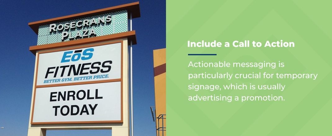
When you’re using signage to advertise your business, you must provide viewers with a way to act. Actionable messaging is particularly crucial for temporary signage, which is usually advertising a promotion. For example, a real estate sign needs to communicate how buyers can learn more. The call to action could be a phone number or a date for an open house.
Even a simple arrow could direct people indoors. A store can also use a temporary sign to promote a sale, saying something like, “This week only, save 20%.” This call to action creates urgency, encouraging customers to act quickly.
Sometimes, permanent signage benefits from a call to action, too. A dentist’s office or barbershop might include a sign that reads, “walk-ins welcome.” The call to action tells a passerby they can enter the business right now and receive service. A window graphic could include a shop’s hours, letting customers know when to visit. It could also list social media handles, letting customers know they can follow the business for updates.
A pylon sign, or any sign visible from the roadside, might tell drivers about a business coming up in the next few miles and which exit to take.
8. Hire Professionals
Everything from design to manufacturing to installation turns out better with an expert’s touch. Signs are often the first thing your visitors encounter, so it’s crucial to make a strong impression. Your signs should be engaging and professional. They also need to be well made from quality materials, so they can last many years.
One of the best tips for creating engaging signs is to work with the pros. A professional sign company will have a team of designers, fabricators and installers who can ensure an attractive and memorable sign. Sign designers are experienced working with textures and depth. They design with attention to simplicity, contrast and size to ensure you have the most readable, engaging sign. They know how to create engaging outdoor signs, and their expertise can help you raise brand awareness and draw in new visitors.
When your sign goes into production, the manufacturing team will cut clean lines and use crisp colors. Then, your installation specialists will ensure the sign is mounted level and secure. When you combine thoughtful design with quality materials and careful installation, your sign is in the best position to impress.
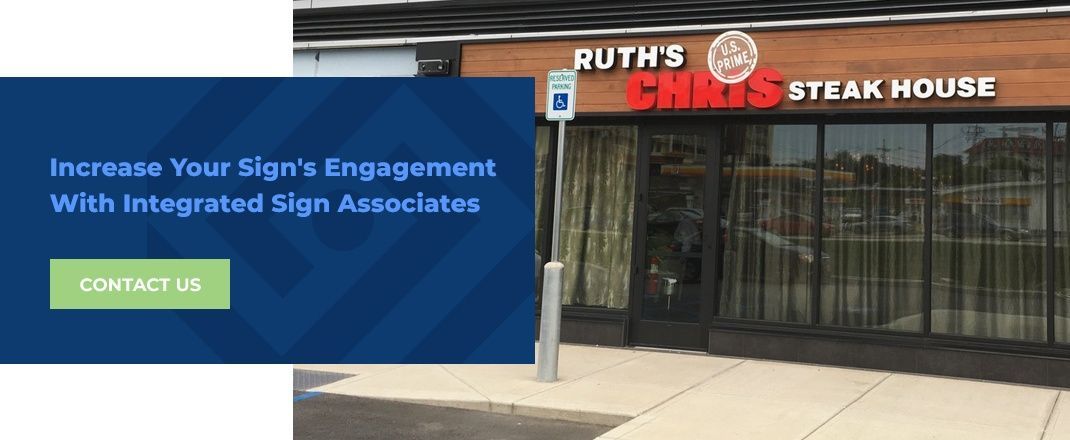
Increase Your Sign’s Engagement With Integrated Sign Associates
Integrated Signs has a knack for one-of-a-kind signs that excite, inspire and delight customers. No project is too custom for us, and we back everything we do with smart design choices. Whether you need street, storefront or interior signage, we can build something you and your customers will love looking at.
Do you need a new sign for your San Diego business? Give us a call at 619-579-2229 or tell us about your project using our contact form. Once you’ve had a design consultation and seen a few drawings, you’ll see just how engaging your sign can be.

