Custom Fabrication • LED Illumination • Permitting • Installation
Channel letter signs are the gold standard for commercial exterior branding because they deliver strong visibility,
durable construction, and clean brand presentation—day or night. This guide breaks down how channel letters are designed,
fabricated, illuminated, mounted, permitted, priced, and maintained so decision-makers can move forward with confidence.
If you’re evaluating signage for a new opening, rebrand, tenant improvement, or multi-location rollout, the difference is rarely “channel letters vs something else.”
The real difference is how the channel letters are engineered: light uniformity, material thickness, sealing, electrical planning, and installation detailing.
Those choices determine what the sign looks like at 100 feet, how it holds up through heat cycles, and how easy it is to service years later.
Below, you’ll find the fabrication specs, LED options, mounting methods, permitting considerations, and realistic pricing ranges you can use for budgeting and stakeholder approvals.
If you need a fast quote, you’ll also see what information speeds up design and permitting.
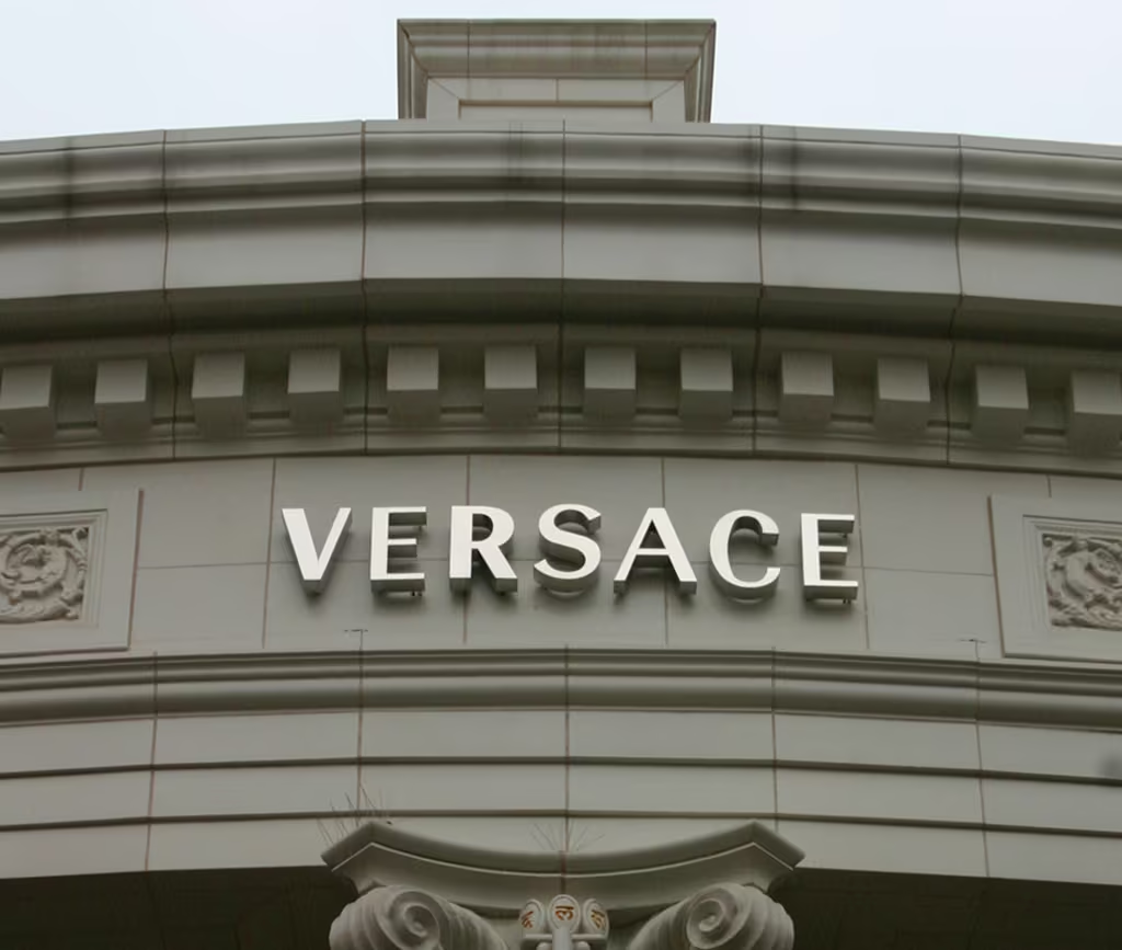
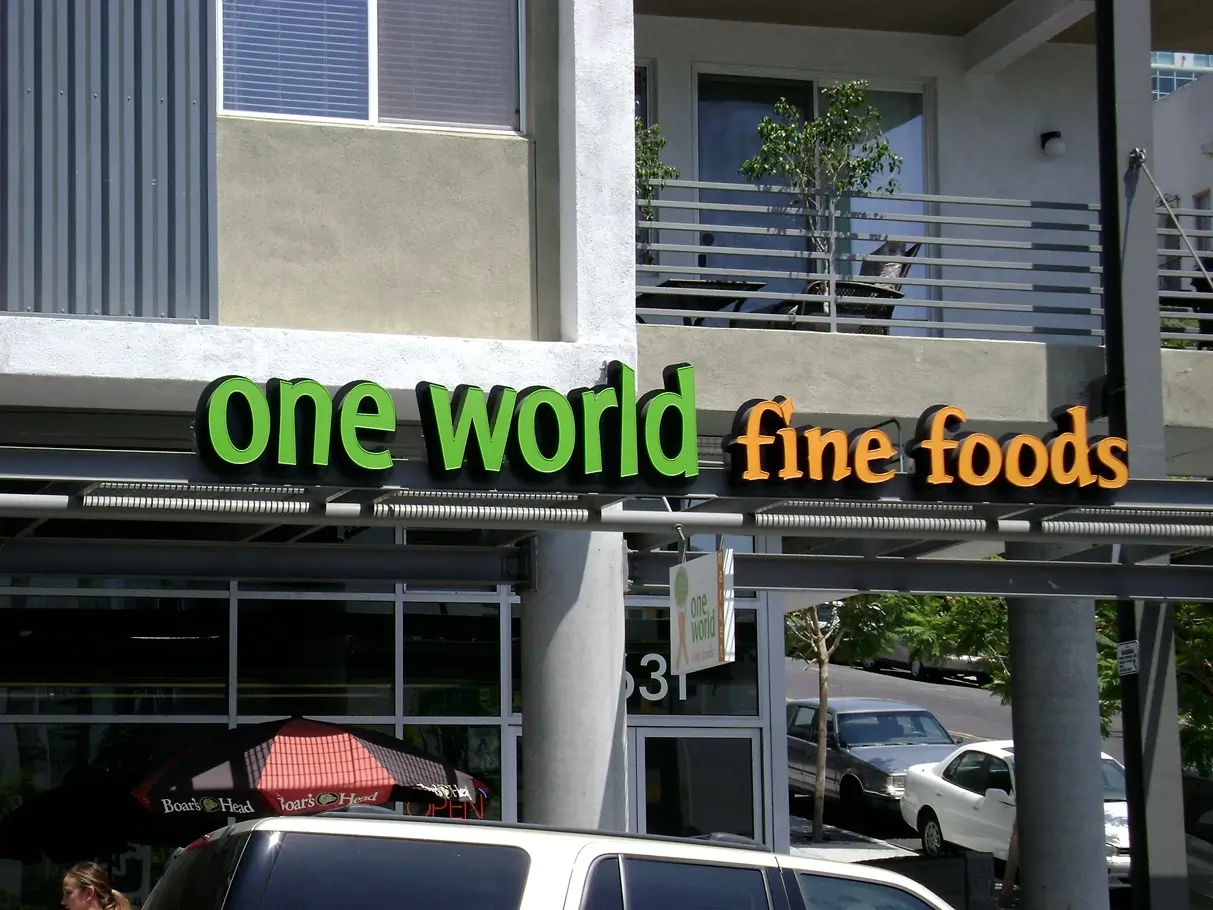
Channel letters are individual, three-dimensional letters (and logo shapes) fabricated as separate units and illuminated from within using LEDs.
Each character is mounted to your building face—either directly (stud mount) or via a raceway/backer system—creating a premium, highly legible sign package.
Compared to flat panel signs, channel letters add depth and dimensionality that reads “higher-end” at a glance. They also scale well: you can build
smaller storefront sets that look sharp up close, or large-format letters for roadside visibility without sacrificing brand clarity.
The key is matching letter size, stroke thickness, and illumination style to how people actually approach your site—driving by at speed, walking in from the lot,
or locating an entrance at night. When those factors are engineered correctly, channel letters become both a brand asset and a wayfinding tool.
If you’re comparing multiple sign types, one practical question helps: Is this a long-term brand location?
If yes, channel letters are often the best value because they’re durable, serviceable, and high-impact.
Great channel letters start with engineering—not just aesthetics. The right sizing, stroke thickness, illumination plan,
and mounting approach reduce permitting friction, prevent visual unevenness, and avoid costly rework.
For structured decision-makers and facility teams, the goal is predictable outcomes: compliant drawings, clear responsibilities, and fewer change orders.
For spontaneous decision-makers, the goal is speed and clarity: “What will it look like?” and “How quickly can it be installed?”
A solid design process answers both without sacrificing quality.
Letter height is typically guided by primary viewing distances—street traffic, parking, or pedestrian approach. Undersizing reduces legibility; oversizing can violate ordinance or landlord criteria.
Design should also consider stroke width, spacing (kerning), and how the sign reads from angles—not just straight-on.
When a logo is included, balance matters. A strong solution keeps the brand mark proportional to the letter set, and ensures the logo remains legible when illuminated—not “blown out” or overly bright compared to the copy.
Vector logos often include thin strokes, tiny internal shapes, or sharp corners that don’t translate cleanly into a 3D build.
Professional fabrication planning refines geometry while preserving brand intent—improving strength, lighting uniformity, and long-term durability.
A common “hidden” issue is minimum return depth and minimum stroke. If a letter is too thin, there’s not enough room for the LED layout and diffusion needed to create a smooth glow. The solution is a fabrication-friendly redraw that still looks like the brand—just engineered to build well.
Uniform light is the goal. LED density, module placement, face material, and return depth work together to prevent hotspots, striping, or dim zones.
The best builds look consistent at dusk, in full darkness, and under harsh ambient lighting.
If your façade is light-colored, halo illumination can appear brighter because it reflects. On dark façades, halo can look subtle and premium but may need higher-output layouts.
This is why mockups should consider actual wall finishes—not generic render backgrounds.
Stucco, brick, EIFS, metal panels, and concrete each require different anchoring and sealing. Wind exposure, coastal corrosion, and heat cycling also influence aluminum gauge, finish selection, and hardware choices.
Engineering for the real environment is what keeps letters tight, aligned, and reliable long-term.
Channel letters are engineered assemblies. Material thickness, sealing, drainage, and electrical layout determine how the sign looks on day one—and how it performs years later.
The specifications below reflect what typically separates professional builds from “looks fine at install” builds.
Fabrication quality shows up in the small things: crisp edges, consistent returns, durable finishes, and a lighting layout that doesn’t telegraph individual LED points through the face.
The goal is a sign that looks clean in daylight, glows evenly at night, and stays serviceable without repeated call-backs.
| Component | Typical Professional Spec | Why It Matters |
|---|---|---|
| Returns (sides) | .040–.063 aluminum, formed to contours Return depth often 3"–6" |
Rigidity, clean edges, improved light distribution on larger letters |
| Backs | .040 aluminum (common) or polycarbonate depending on style | Affects stiffness, heat handling, and service access |
| Faces | UV-stable acrylic (often 3/16"–3/8"), color-matched / translucent vinyl | Color accuracy, fade resistance, and diffusion quality |
| Fastening | Welded or mechanically fastened returns; reinforced as needed | Durability and reduced seam separation over time |
| Sealing | Continuous silicone sealing at seams; gaskets where appropriate | Moisture control and fewer electrical/corrosion issues |
| Drainage | Engineered weep holes / condensation management | Prevents trapped moisture and internal damage |
| Finish | Painted/powder-coated returns for UV and corrosion resistance | Keeps colors sharp and reduces oxidation in harsh climates |
| Electrical | UL-listed LEDs, power supplies, wiring, and connectors | Safety, inspection readiness, consistent performance, easier servicing |
Material selection also influences how “premium” the sign reads up close. Clean returns, consistent paint, and crisp acrylic edges matter because the sign will be photographed, posted, and seen repeatedly by returning customers.
In other words: channel letters are marketing infrastructure, not a one-time decoration.
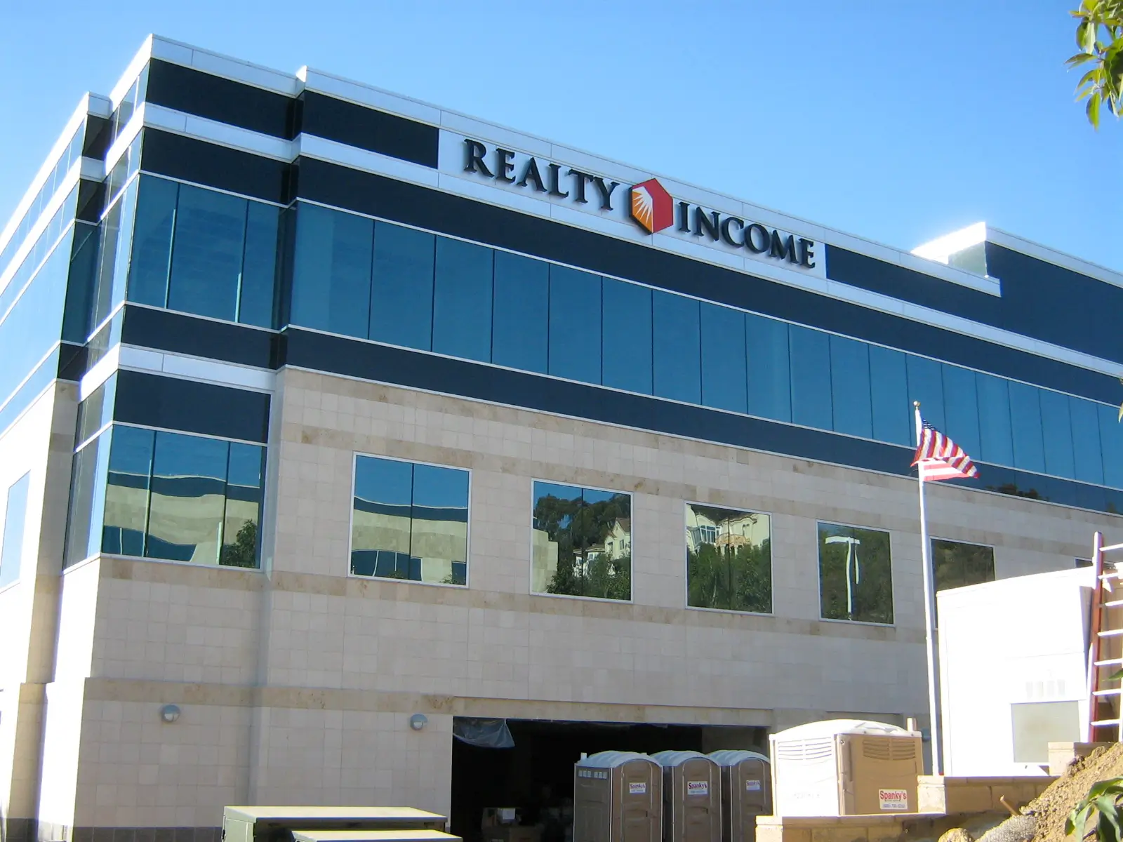
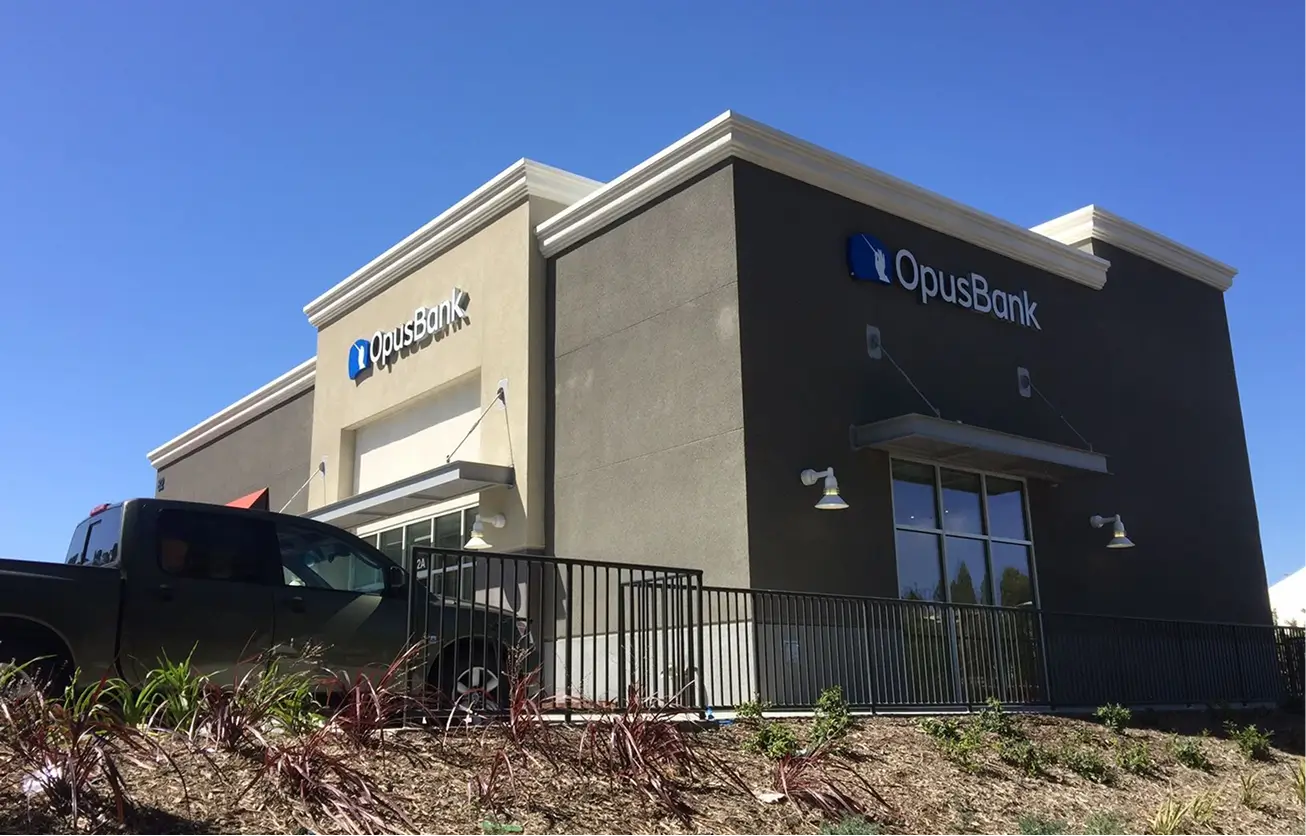
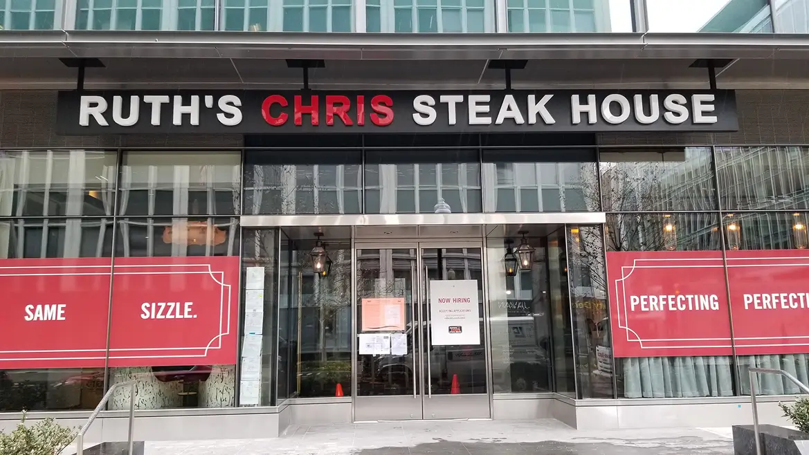
The “right” style is usually determined by your brand personality, property standards, and local rules. Front-lit tends to maximize readability at distance.
Halo-lit can feel more architectural and refined. Combo-lit is high-impact, but not always allowed by ordinance or landlord requirements.
The LED system controls brightness, uniformity, efficiency, and service life. Proper engineering avoids hotspots, striping,
dim zones, and premature failures—especially on larger letters or complex logos.
From a buyer perspective, LEDs should be evaluated the same way you’d evaluate lighting in a facility: reliability, consistent output, and ease of service.
A well-built channel letter set should look evenly illuminated across every letter—not brighter on one side, not “speckled,” and not dim in smaller internal cavities.
LED selection is also tied to depth and diffusion. Shallower letters can require more careful spacing to avoid hotspots.
Larger letters can require more modules to maintain uniformity across wide face areas. The best approach is an engineered layout, not a generic “rule of thumb.”
White LEDs are specified by color temperature. Cooler whites appear crisp and modern; warmer whites feel more inviting.
Uniform diffusion depends on face material, letter depth, and correct LED spacing.
Color and brightness should also match the environment. A sign that looks perfect in a dark area can feel overly bright in a dense retail corridor with many illuminated neighbors.
Conversely, a sign that’s too subtle can disappear when competing signage and street lighting are strong.
Power supplies are a common failure point in low-quality builds. A professional system sizes power supplies correctly, uses outdoor-rated components, protects wiring paths,
and plans service access—reducing downtime and repeat service calls.
For property managers and facility teams, service access matters as much as initial appearance. Planning where power supplies live (and how they’re accessed)
can turn a future repair into a quick swap rather than a major service call.
Mounting affects aesthetics, wall penetrations, wiring concealment, and long-term service access. The best method depends on the façade, landlord criteria, and the look you want.
In multi-tenant settings, landlords often have preferences (or requirements) around how wiring is concealed and how many penetrations are made into the building envelope.
In owner-occupied buildings, aesthetics typically lead—especially when the sign is a core brand statement.
Raceway mounting is commonly used in shopping centers because it reduces risk to the building envelope and can streamline inspection.
When color-matched correctly, it reads cleanly from the street while keeping wiring organized and accessible.
Direct mounting is the “premium” look, especially for halo-lit letters where you want the letters to appear to float off the wall.
It requires precise layout, sealing discipline, and electrical planning to protect the façade and maintain long-term reliability.
Backer panels are often used when the building surface is irregular or when you want to visually “frame” the letter set.
They also simplify removal or future tenant changes, which can be helpful for property managers and landlords.
Permitting is where many signage projects stall—especially for openings, rebrands, and multi-location programs. Plan early for code checks, landlord approvals, and electrical inspections.
Most delays come from misalignment: a design that looks great but exceeds allowable sign area, a landlord standard that requires a raceway, or an electrical plan that isn’t inspection-ready.
The best approach is to treat permitting as part of the engineering process, not a last step.
If you’re part of a corporate team or multi-location rollout, consistency is critical. Standardizing sign specs helps, but local ordinances still vary.
A compliant program anticipates those differences and builds flexible standards that can adapt without compromising brand integrity.
Some jurisdictions move quickly; others require multiple review rounds. If your opening date is fixed, begin landlord and code review early—fast fabrication can’t compensate for slow permits.
When speed matters, the smartest “fast” move is early alignment: confirm allowable size/placement, choose a mounting method that meets landlord standards, and prepare inspection-ready electrical planning upfront.
That prevents the most common rework loop: submit → revise → resubmit → delay.
A professional channel letter project should feel controlled and predictable—especially when multiple stakeholders are involved.
Below is the common end-to-end workflow that reduces surprises and keeps the schedule defensible.
Timelines vary most at the permitting stage. Once approvals are in hand, fabrication and installation can be scheduled with much higher reliability.
If you have a hard deadline (grand opening, ribbon cutting, event), the best way to protect it is to start approvals early and lock the sign design quickly.
For relationship-driven buyers and property managers, communication is part of the process: clear status updates, installation scheduling coordination, and quick response when questions come up.
A controlled process is what turns signage into a long-term partnership instead of a one-off transaction.
Channel letter pricing varies by size, complexity, site conditions, access equipment, and permitting/engineering requirements.
The ranges below reflect professional fabrication and installation.
If you’re comparing quotes, focus on what’s included. A “lower” price can become more expensive if it excludes permits, engineering needs, electrical readiness, or long-term serviceability.
The right quote should make scope clear and avoid surprises.
| Project Type | Typical Range | Notes |
|---|---|---|
| Small storefront set | $3,000 – $6,500 | Depends on letter height, quantity, and mounting approach |
| Mid-size commercial | $6,500 – $12,000 | Common for larger façades or higher-visibility placements |
| Large / complex logo program | $12,000 – $25,000+ | Large formats, premium lighting, access equipment, engineering/permits |
A practical way to budget is to provide the information that removes assumptions: desired letter height, photo of the building face, approximate placement, and the city/jurisdiction.
That allows a tighter range and a clearer scope—especially if stakeholders need a defendable estimate.
Professionally built channel letters are designed to be low-maintenance and serviceable. Over time, power supplies and LEDs are the most common service items—not the letter structure itself.
The biggest determinant of long-term performance is not “whether the sign uses LEDs,” but whether the LEDs and power supplies were engineered and installed for your environment.
Outdoor-rated components, protected wiring paths, and smart placement of power supplies reduce future downtime.
If you manage multiple locations, it’s also worth standardizing replacement parts (where possible) so future service can be handled quickly.
A consistent spec reduces procurement friction and makes maintenance easier to plan.
Low-cost channel letters can look acceptable at first glance but fail early due to thin aluminum, inferior LEDs, poor sealing, or rushed installation.
Professional fabrication reduces risk and improves total cost of ownership.
From an analytical buyer standpoint, quality shows up in measurable outcomes: fewer service calls, cleaner illumination, better legibility from distance, and more consistent brand presentation across locations.
From a relationship buyer standpoint, quality shows up as responsiveness, accountability, and warranty support.
If you want to compare vendors intelligently, ask how they handle permitting, what their standard materials are, how they plan for service access, and what documentation you receive at closeout.
Those answers often matter more than a small difference in price.
Your sign is your first impression. Let’s make sure it gets approved, built, and installed without surprises.