Environmental graphic design uses visual cues to create an immersive, stimulating experience. It allows you to tell your unique story with every element of your space. It takes many different forms, serving practical and artistic purposes. School, museum, park and workplace environmental graphic design turns a three-dimensional space into an immersive, other-worldly experience.
This is a powerful tool for artists, historians, marketers and anyone wishing to capture attention with design. In a large city like San Diego, memorable signage helps businesses and organizations stand above the noise.
This unique form of visual communication serves many purposes. Environmental graphics convey emotions, establish direction and communicate purpose. You can use environmental design to aid in wayfinding, exhibit facts or ideas, establish placemaking or invite engagement. When done well, it can be educational, entertaining, emotional and memorable. Environmental design has helped many companies achieve a three-dimensional branding experience. In any case, it’s an immersive form of presentation, sure to leave a lasting impression. Here are eight examples of environmental graphic design.
Table of Contents
- Wayfinding
- Exhibition
- Placemaking
- Public Installations
- Contact Integrated Sign Associates to Learn More
Wayfinding
Whenever you visit a new space, you rely on directional signage, including arrows, floor-level indicators, room numbers and maps. These are all various types of wayfinding elements that help visitors navigate a space. They allow guests to find their way around on their own without needing constant assistance. Here are two examples of the impact of wayfinding.
1. Hotel Wayfinding in Moscow: Simple Illustrations
These wayfinding signs in a Voskresenskoe hotel eliminate any language barrier obstacles. Instead, simple illustrations and arrows explain what visitors can expect in each corner of the building. A stick figure lying on an elevated mat with another stick figure beside represents the massage parlor. A simple hanger represents a closet. A drawing of a cocktail represents the bar. Each image is easy to interpret at a glance and leads guests to their destinations. Incorporating this style with bright colors throughout the entire building establishes a unique environment.
2. King of Prussia Mall Directories
The King of Prussia Mall in Pennsylvania is the country’s third-largest mall and has over 400 stores. With so many places to shop, the mall’s wayfinding has to be effective. Thousands of visitors rely on directories and signage to find specific stores and restaurants. Clear, detailed directories are also important for workplaces, hospitals, strip malls and any multi-tenant facilities.
Exhibition
You’ll find exhibition design all around you, in museums, libraries, zoos, college campuses, corporate offices and many other locations. This type of signage conveys information, educating the observer. It’s a compelling, three-dimensional way to learn about something. Think back to grade school — would you rather read about the dinosaurs in a textbook or walk through the dinosaur exhibit at a natural history museum? You’d likely choose the museum. Texture, color and scale can make any topic more interesting. Here are some popular exhibition signage examples.
3. City of Irvine Walkable Timeline
In Irvine, California, exhibition design helps visitors remember history. Located at a former Marine Corps Air Station, a walkable timeline teaches visitors about the major events of the 1940s. It expands over 2,600 feet, with markers detailing 162 historic events. This provides an unforgettable way to learn about the area’s history.
4. The National Aquarium in Baltimore
Featuring over 800 species, the National Aquarium in Baltimore, Maryland, is a popular tourist destination. To accommodate self-guided tours, the aquarium features hundreds of educational signs, some interactive. Guests can follow this exhibition design to learn more as they walk through the aquarium. Each sign is stylized to fit its display, with oceanic color schemes and elements.

Placemaking
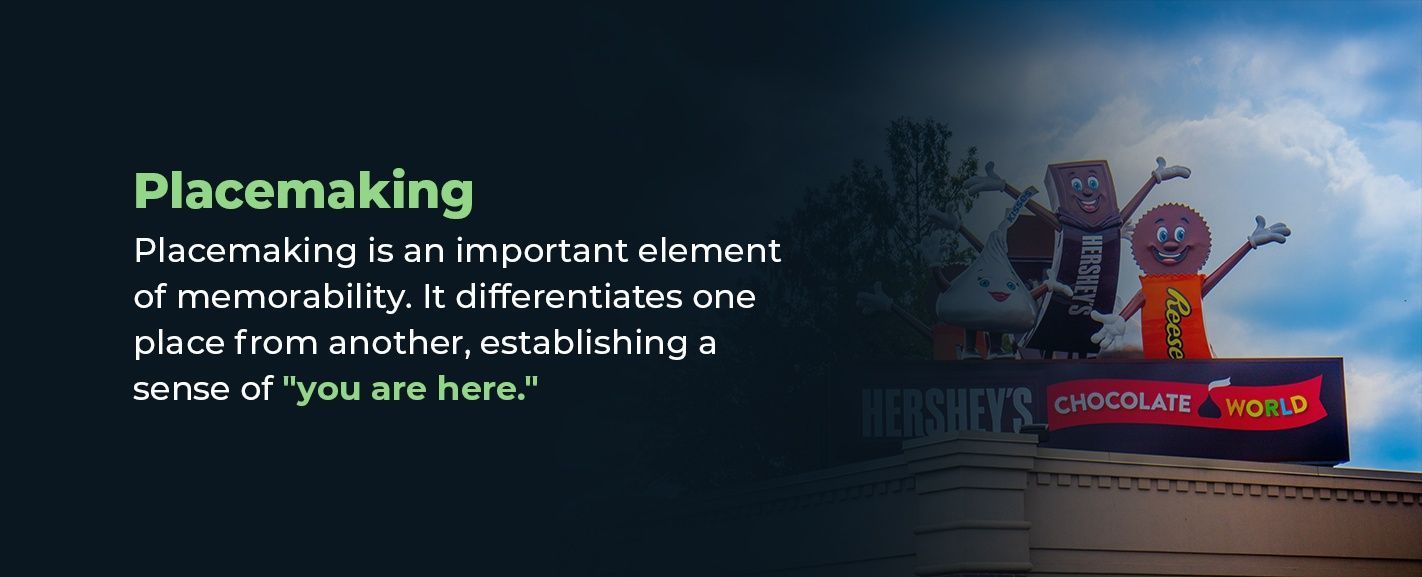
Placemaking is an important element of memorability. It differentiates one place from another, establishing a sense of “you are here.” This creates a place’s unique identity — with successful placemaking, you’ll never feel lost or unsure where you are. Many companies use this to instill a stronger sense of brand recognition. Here are some other successful placemaking examples.
5. The Capital One Arena
In reality, almost any sports stadium or arena could serve as an example of placemaking, but one especially successful example is the Capital One Arena — home of the National Hockey League team the Washington Capitals. The home team’s colors of red, white and blue persist through all signage, including seat row indicators, scoreboards and advertisement banners. It’s no secret who you’re meant to root for in this stadium. This makes fans feel at home and builds up excitement before the game. It also inspires increased team loyalty, which helps sell merchandise.
6. Hershey Park
As soon as you walk through the Hershey Park entrance, you feel the spirit of adventure, fun and whimsy. Every design element helps establish these themes, from the town’s kiss-shaped lights to the three-dimensional candy character height measures. With every detail around you, you feel you’ve entered an alternate world. The emotional appeal is unignorable.
Public Installations
Inviting audiences to pause, think and interact, public installation graphic design can be powerful and unforgettable. It’s used for advertisements, awareness campaigns, calls-to-action or tourist attractions. Regardless of their intended purposes, public installations make an impression. Here are two famous public installation examples.
7. Fearless Girl Statue in New York
Fearless Girl stood with her feet apart and hands on her hips, facing the Charging Bull statue in New York City, before she was moved around the corner to stand on Wall Street. To many, this famous public installation represents feminism and women’s empowerment. However interpreted, the statue is powerful and garners a lot of attention.
8. Guggenheim Museum Puppy
Another famous public installation is the Jeff Koons’ puppy sculpture, sitting outside the Guggenheim museum in Spain. The puppy is alive, in a way. Tens of thousands of flowers make up his coat, with a steel frame holding it all together. It draws in tourists and promotes the museum while adding color and beauty to the city.

Contact Integrated Sign Associates to Learn More
Environmental graphic design is a powerful tool. It can create a sense of novelty, belonging and clarity. It can turn an idea or brand into an immersive three-dimensional experience, inviting engagement and stimulating the senses. Examples can be larger-than-life sculptures or simple stick-figure sketches. If it helps establish a sense of place, imparts information or evokes emotion, it can be effective environmental graphic design.
You can use environmental graphic design elements to improve your space, making it more memorable, more effective or easier to navigate. Here at Integrated Sign Associates, we can help you achieve those goals. We create unique, custom signs using the latest technology. Made with long-lasting materials, our signs stand the test of time. Contact Integrated Sign Associates to learn more about environmental graphic design or request your free quote.


