- April 15, 2020

What Are the Best Colors for Business Signs?
You might think colors aren’t all that central to your signage — what matters is that people can read it, right? Well, as it turns out, colors are essential in making that a possibility. Colors influence the contrast, legibility and the distance at which people can read your sign. Plus, they can contribute to or detract from the image you work so hard to cultivate for your company.
But colors can be more complicated than they seem. Concepts of color matching and visibility involve a lot of choices, and when your company’s image is on the line, those decisions are critical. Fortunately, with the right information, you can select colors that can bring you more attention, direct your customers or spread your marketing goals.
Why Is Color Choice Important for Signs?
The right color choice can accomplish a variety of tasks that help improve the effectiveness of your sign.
- Improve visibility: Specific colors draw the eye more than others. If you have a red sign next to a white one, you can imagine red would grab your attention more. However, you’ll have to consider the colors of the signs against the hue of the background. Putting that same red sign on a red wall won’t make it pop, but putting it on a black one will.
- Increase contrast and readability: Color combinations result in different levels of contrast, which is a large part of a sign’s legibility. Imagine navy blue text on a forest green background — it would be harder to read than other options that carry a high amount of contrast. Black on white and white on black are the classic examples of easy-to-read text with high-contrast colors.
- Boost your marketing efforts: Most businesses have signature colors or a color scheme that they use throughout their marketing and branding imagery. It can support the tone they want to portray and help increase brand recognition as guests see these images over and over. Consider your favorite fast-food restaurants. You can probably rattle off their colors pretty readily because you see them all over the restaurant when you visit and on advertisements galore.
- Improve design elements: Tying in with the previous aspect, colors help promote design features. Some colors can have the effect of calming people down, making them hungry or more emotional. Other colors carry specific associations. White, for instance, has a connotation of simplicity and cleanliness, while many people instinctively associate green with growth, nature or even toxicity if it carries the right shade. You can use these associations to make people think differently about your company.
All these elements rely on color for the maximum effect, which is why it’s so critical to select the right ones.
What Color Attracts the Human Eye the Most?
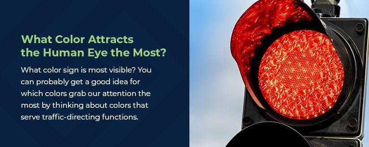
What color sign is most visible? You can probably get a good idea for which colors grab our attention the most by thinking about colors that serve traffic-directing functions. We see red in stoplights and stop signs, and we’ll find yellow on yield signs and other cautionary markings. You’ll also see red and yellow on most large fast-food chains because of the energetic, attention-grabbing effects of these colors. If your goal is to get as many eyes on your sign as possible, red or yellow are excellent options, but they could have some side effects.
- Yellow: Yellow is a bright, adventurous color that often carries associations with sunshine and optimism. It is also very fatiguing to the eyes. Going shopping in a store with vibrant yellow signage everywhere is sure to tire you out and make you want to give your eyes a break. Some people find it incredibly irritating. Consider using it for attention-grabbing signage, such as something on the side of the road, but not for informational signs or design features where they can be overwhelming. A little bit of bright yellow goes a long way. Lighter shades of yellow are much less fatiguing and more suitable for large-scale usage.
- Red: Red offers a lot of flexibility as a color choice. It can encourage feelings of aggression, liveliness, passion, excitement and other energetic emotions. It’s common in restaurants, where it can make people feel hungrier or more impulsive. It is also a common way to signify danger or a need to stop and pay attention, such as at a stoplight.
Part of the reason these colors are so good at capturing attention is that you’re less likely to encounter them in nature, so they are more apt to stand out against their environment. Placing a green sign in front of a backdrop of trees isn’t going to stand out much. But, put that same green sign in front of a light blue sky, such as on a highway exit, and you can see it pretty well.
Neutral colors tend to blend in well with nature, but bright ones pop. Finding the best colors for outdoor signs will require some knowledge of what the landscape looks like. Understanding your sign’s placement and ensuring an appropriate contrast is a crucial part of improving its attractiveness and making it stand out.
What Are the Most Visible Color Combinations for Signs?
While the main color of your sign is essential, so is the information you pair with it. People need to be able to understand the sign, after all. Colors and contrast go hand in hand, and part of making your sign legible is choosing colors with sufficient contrast.
Contrast
Color contrast for signs is how colors look when paired. Some colors will be easier or harder to read alongside others, based on the difference between the two hues. We’re used to seeing dark text on white backgrounds, but what about blue text on a red background? Or red text on a pink background? These combinations aren’t ideal choices for creating legible text because they lack appropriate contrast.
When deciding on hues that lend themselves to both visibility and legibility, it helps to understand a bit about color theory. We call colors opposite each other on the color wheel complementary colors — for example, blue and yellow. The high contrast of complementary colors creates a vibrant look, particularly at full saturation.
Here are some tried-and-true combos that offer the best color contrast for signs:
- Black, red or dark blue text on a yellow background
- White or yellow text on a black background
- White or yellow lettering on a dark blue background
- Yellow, black or white text on a red background
White backgrounds are unique because they create a wide range of usable color combos. White is a highly reflective color, bouncing back 75 to 90% of the light that hits it. Beware of using black on white for large signs, because the high-contrast black can recede into that reflective background, making it harder to read. A low color-contrast choice like gray or dark blue can still stand out on a large white sign. Similar to white backgrounds, metal signs also look good with a wide variety of colors, but black is especially readable.
Color is critical, but you’ll also have to think of a few other factors when considering readability, such as the purpose of the sign. Attracting people who are driving by will require more contrast than a sign that tells people the name of the room they are entering. Wayfaring or directional signage needs to be highly visible but doesn’t need to be garish or extra bright. Advertising signage should attempt to stick to the brand’s colors to stay consistent.
Legibility
You’ll also want to ask yourself how far away people will be when reading the sign. Again, if people are looking at it from the highway versus a few feet away, your text requirements are going to be different.
Below are some common distances and the minimum text sizes that need to accompany them for legibility. These numbers are assuming good lighting and eyesight.
Letter Visibility Chart
| Maximum Readable Distance | Readable Distance for Maximum Impact | Letter Height |
|---|---|---|
| 100′ | 30′ | 3″ |
| 150′ | 40′ | 4″ |
| 200′ | 60′ | 6″ |
| 350′ | 80′ | 8″ |
| 400′ | 90′ | 9″ |
| 450′ | 100′ | 10″ |
| 525′ | 120′ | 12″ |
| 630′ | 150′ | 15″ |
| 750′ | 180′ | 18″ |
| 1000′ | 240′ | 24″ |
| 1250′ | 300′ | 30″ |
| 1500′ | 360′ | 36″ |
| 1750′ | 420′ | 42″ |
| 2000′ | 480′ | 48″ |
| 2250′ | 540′ | 54″ |
| 2500′ | 600′ | 60″ |
Note: The above distances will vary by approximately 10% with various color combinations. Maximum distance in color would be red or black on a white background. 5,280 feet = 1 mile.
Another way to tackle issues of legibility is to turn to images. Many signs, like exits or restrooms, use icons and images to get their point across. These can often help you make signs visible from longer distances. Just make sure the icons are standard, like the ones provided by AIGA, so people know what they mean.
What Color Is Easiest to Read at a Distance?
Part of what makes color such a complicated science is due to the way we perceive it. If you think back to science class, you may remember that our eyes contain three types of photoreceptors, or cones, that pick up different colors.
During the daytime, our eyes pick up green the most readily, with yellow and blue following suit. At night, yellow becomes the most visible color.
While green is easy to see from far away, keep in mind the importance of giving your signs contrast from their environment. High color contrast can help determine what color is the easiest to read.
Are Internally Illuminated Signs Easier to Read?
Another way to improve the legibility of your sign is to consider backlighting, face-lit channel letters or LED signs. By adding illumination to your signage, you can make it stand out and increase readability in the dark. The best outdoor sign colors offer high contrast for maximum visibility, but white light is usually a sound choice as the best color for backlit signs. Plenty of other colors still work well, but sometimes, they are more effective as accents than the main text color.
If you want your sign visible at night, internally illuminated is a great way to do so. Businesses that are open 24 hours or want to continue advertising after the sun goes down can benefit greatly from an always-on sign. Many depend on it, and one report from Charles R. Taylor at Villanova University found that businesses estimated an 11% drop in sales if government regulations prevented them from illuminating their signs. This statistic shows what a valuable role signage plays in marketing for many companies.
What Is the Best Color for a Sign?
The answer to that question relies on a lot of variables. When it comes to choosing the best color combos for signs, you have to balance aspects of readability, brand identity and attention-getting. You’ll also need to consider which aspects are essential in specific locations. If you’re adding several signs to a building, you can change things up and emphasize various features at different spots. This approach helps make your signs effective in their given purpose and allows you to add variety, which over 60% of consumers find interesting and appealing.
Remember, each color can mean something different for your business. Finding the best colors for business signs depends on the company. They can significantly contribute to the image and tone you want to create. Here are some of the associations that come with popular colors — leaving out red and yellow, which we already touched on.
- Black: Black signs tend to feel powerful and sleek, ideal for sophisticated environments. It can add a drab tone if you overuse it, though, so be sure to complement it with other colors.
- White: A pure white color is common across minimalistic, polished businesses that prize cleanliness and an airy atmosphere. It could, however, come off as cold or clinical and not particularly inviting.
- Blue: There are many shades of blue, so design options are versatile. However you slice it, blue is an enduringly popular choice for business colors. It is calming and tranquil and inspires confidence. It’s mature, but enjoyable, appealing to many.
- Purple: Purple is less traditional and can point to creativity, the arts and mystery. It also links to royalty and wealth, which can give your brand a high-end feel.
- Pink: Romantic and calming, pink typically helps businesses market to the female audience. It can feel romantic. Light pink colors are calming, but hot pink shades can offer unique vibrancy.
- Green: Typically associated with nature and freshness, green often signifies things like eco-friendly practices or selling fresh food. Many shades feel calming, too. Just make sure to use a pleasant hue — otherwise, it could come off as sickly.
- Gray: Gray goes with many colors, making it easy to match up. It is sophisticated and calming, but you run the risk of coming off as dull, so it’s best to pair it with accent colors. (Gray is difficult to light)
- Orange: Orange is similar to yellow in that it can be fun but somewhat aggressive, so you want to be careful with it. It’s more of an accent color.
- Brown: Brown is earthy and warm. It can create a homey, cozy tone, especially if paired with reds. A lighter brown, closer to beige, can also serve as a simple neutral. (Brown is difficult to light)
If you already have business colors, you have an excellent basis to inform your sign-making decisions. If you don’t have previously defined colors, you may have some choices ahead of you. Consider what these colors mean for your image from all angles. Do they create the emotion you want customers to have? If you’re trying to grab attention, will your colors do the trick? Is your environment conducive to the colors you’ve chosen?
If you’re unsure or need some more guidance, it’s always a smart idea to team up with an expert. Sign printers work with these designs daily and know what makes a good sign. Whatever your goal is and whatever sign you’re trying to make, our experienced team can help you make color choices that support your needs.
Partner With ISA for Business Signage and Color Assistance
The importance of color isn’t one we can understate — it is critical for the success and effectiveness of a sign. As you’ve now seen, finding the best colors for business signs requires asking yourself many questions about the needs of your business and your readers. Only then can you find the best colors for your signs.
If you’re in the San Diego area, you see the highly competitive advertising landscape that surrounds you every day. Colors play a pivotal role in making your business stand out, and Integrated Signs is there to help. We assist San Diego businesses with signs and color contrast to make signage that grabs — and holds — consumers’ attention.
To see what Integrated Signs can do for your business, in San Diego or elsewhere, request an estimate today!

